A London-based, independent creative studio specialising in visual identities, digital design and photography.
Space Between
Scope
Naming
Brand Identity
Visual Identity
Print Design
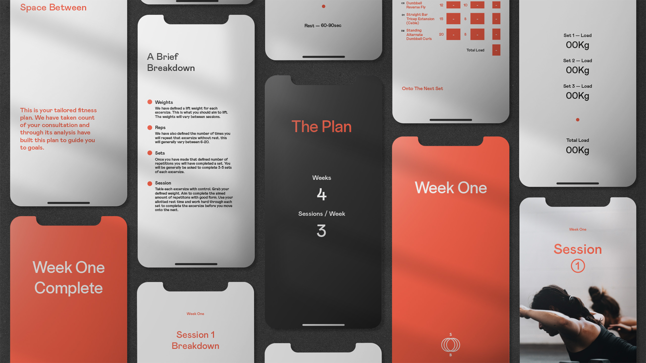
Digital Design
Art Direction
Agency
Public London Ltd
A New Standard For Fitness
Space Between offers a luxury, deeply personal health and fitness experiences. As wellbeing becomes more than a trend, Mark saw people craving something real — space to breathe, grow, and evolve on their own terms. That’s where Space Between steps in.
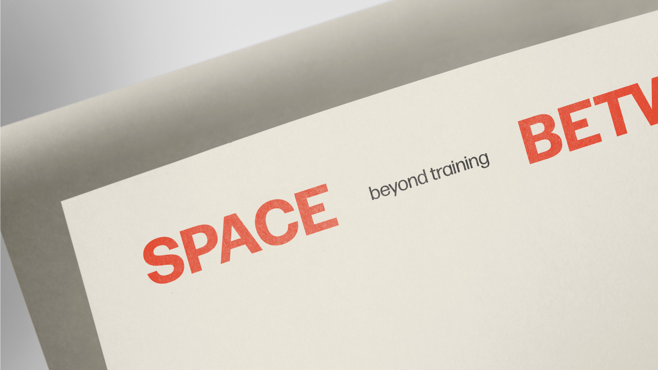
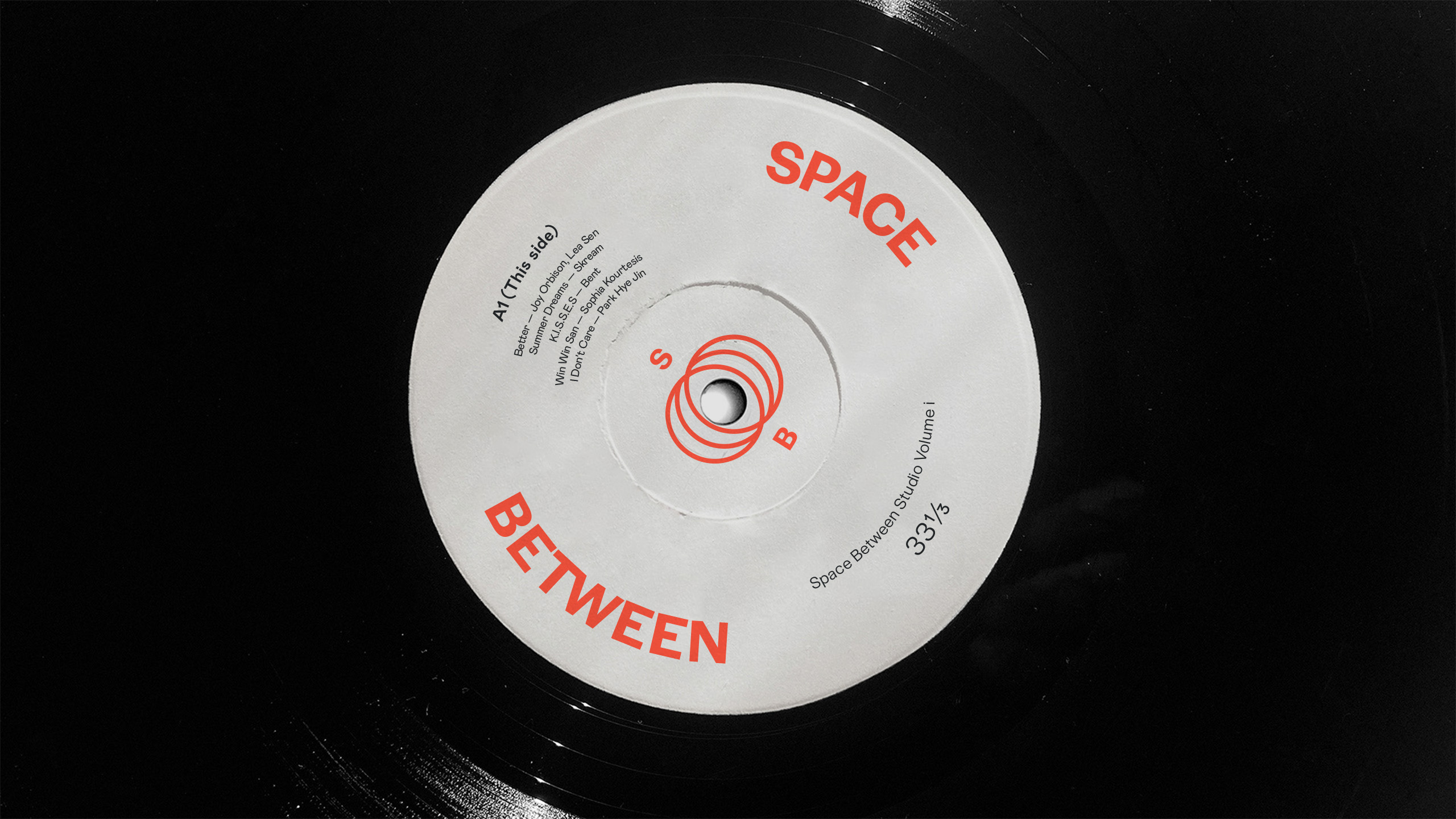
We developed the name Space Between to embody the ethos: ‘growth happens in the journey, not just the destination.’ It speaks to creating space — to breathe, grow, learn, and evolve — and embraces fitness as a personal, open-ended pursuit.
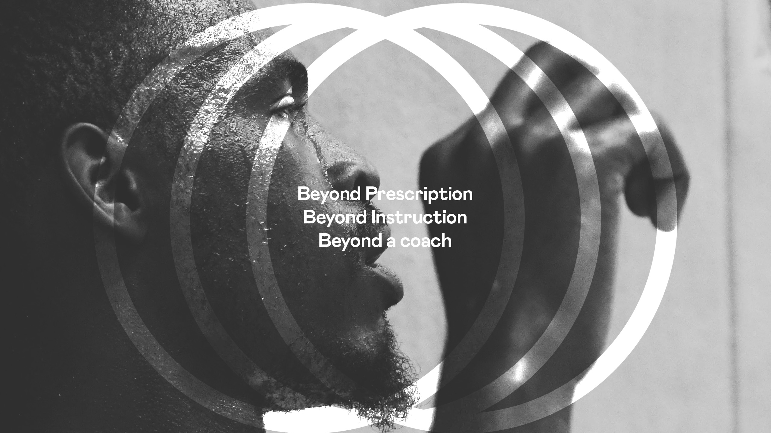
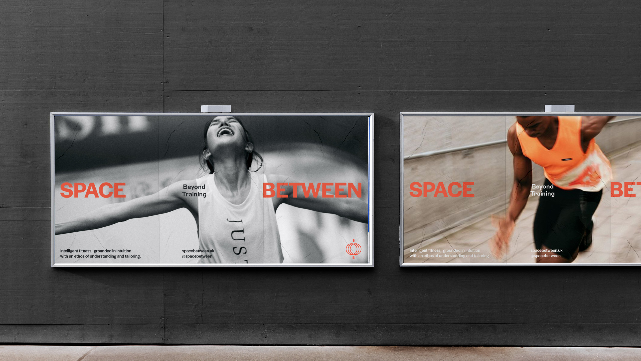
The tagline ‘Beyond Training’ reflects this philosophy: beyond coaching, beyond prescriptions, and beyond the physical — This is about building real relationships, creating space for release and reflection, and helping people find their own version of success — whatever that looks like.
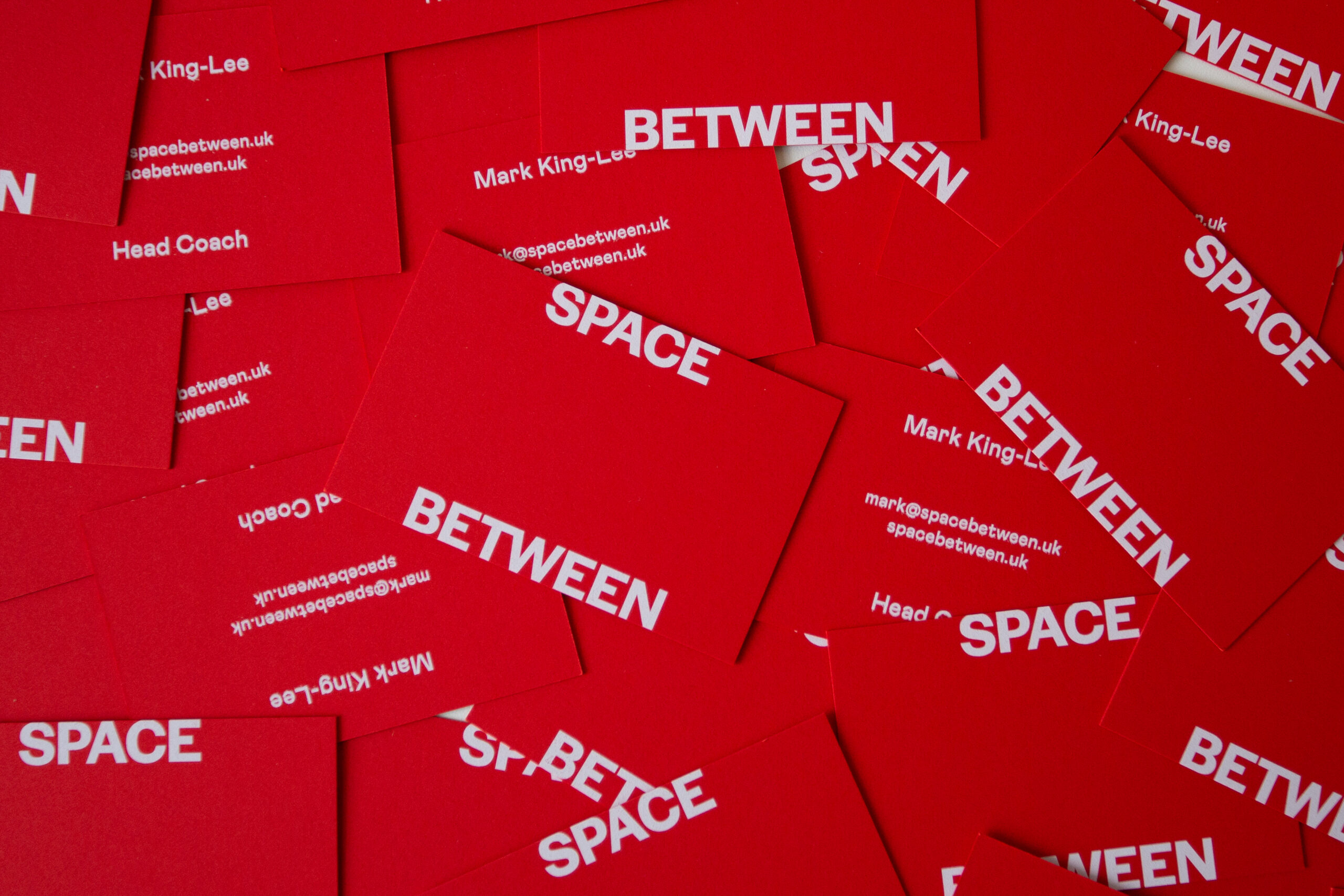
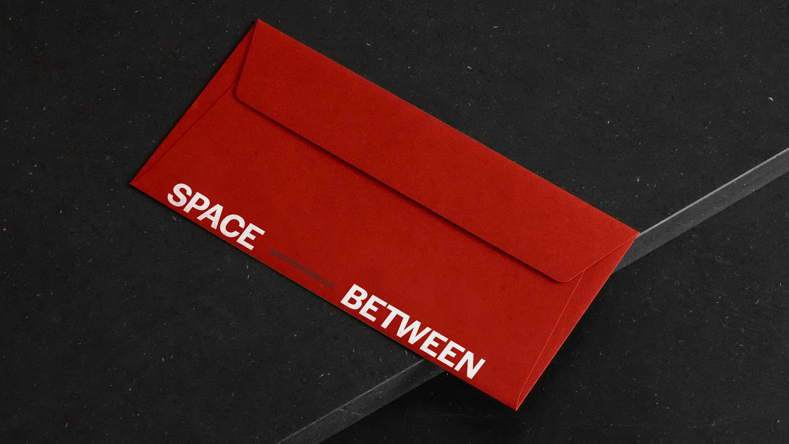
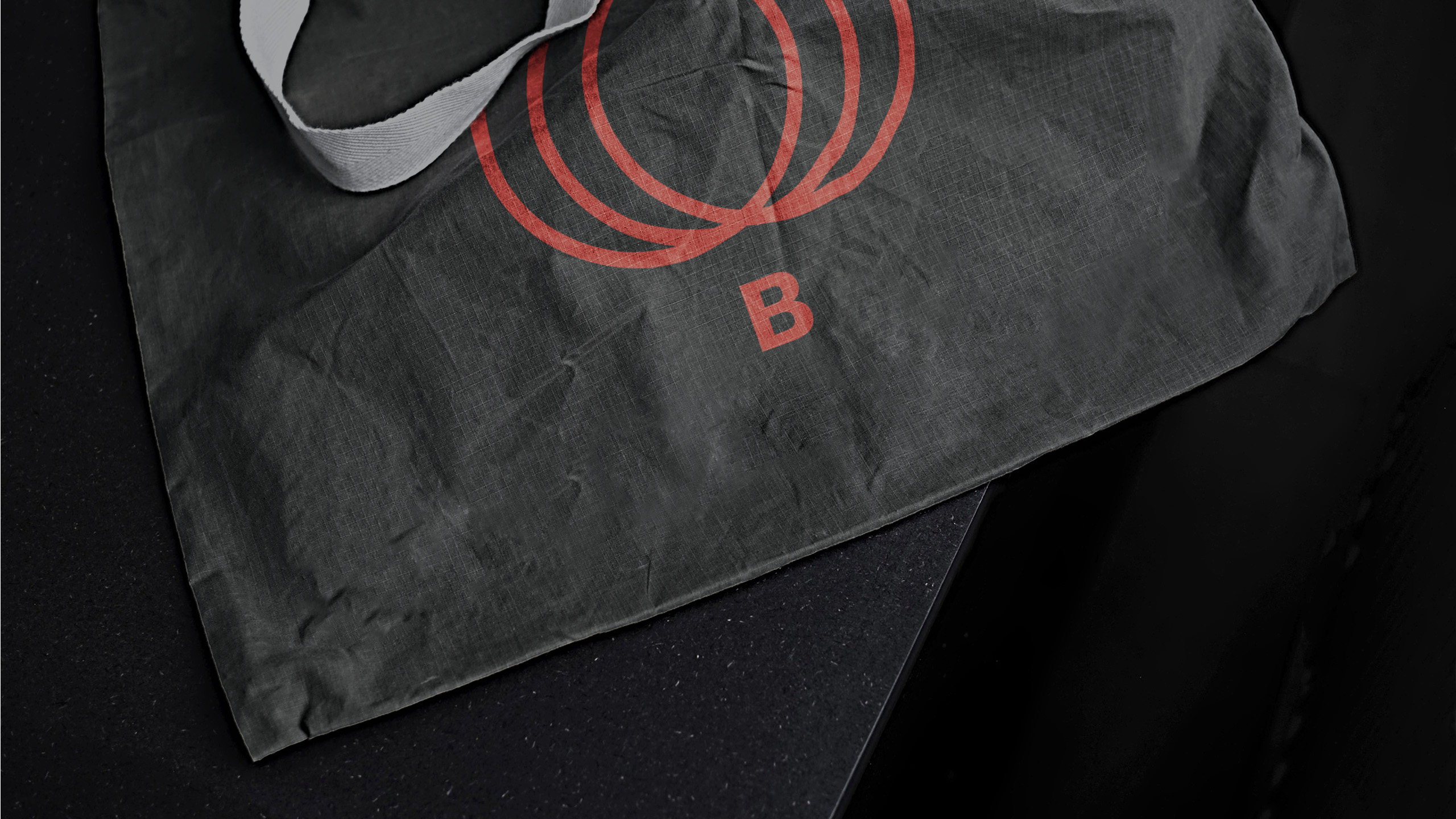
Visually, the brand keeps things bold yet simple. Overlapping circles in the logomark reflect journeys. The wordmark breathes with space, echoing the clarity and calm the brand offers. A confident Crimson Red leads the palette, paired with imagery that feels raw, human, and honest.
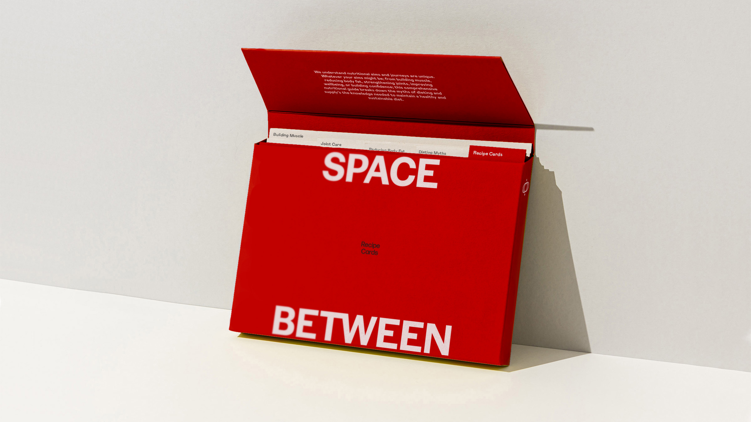
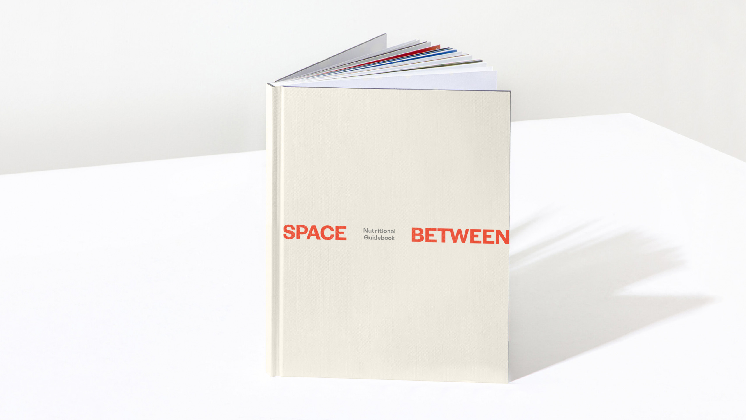
Even print materials invite connection — with space left blank for handwritten notes, every touchpoint feels personal and considered.
Scope
Naming
Brand Identity
Visual Identity
Print Design
Digital Design
Art Direction
Public London Ltd