A London-based, independent creative studio specialising in visual identities, digital design and photography.
Fudge And Sons
Scope
Naming
Visual Identity
Print Design
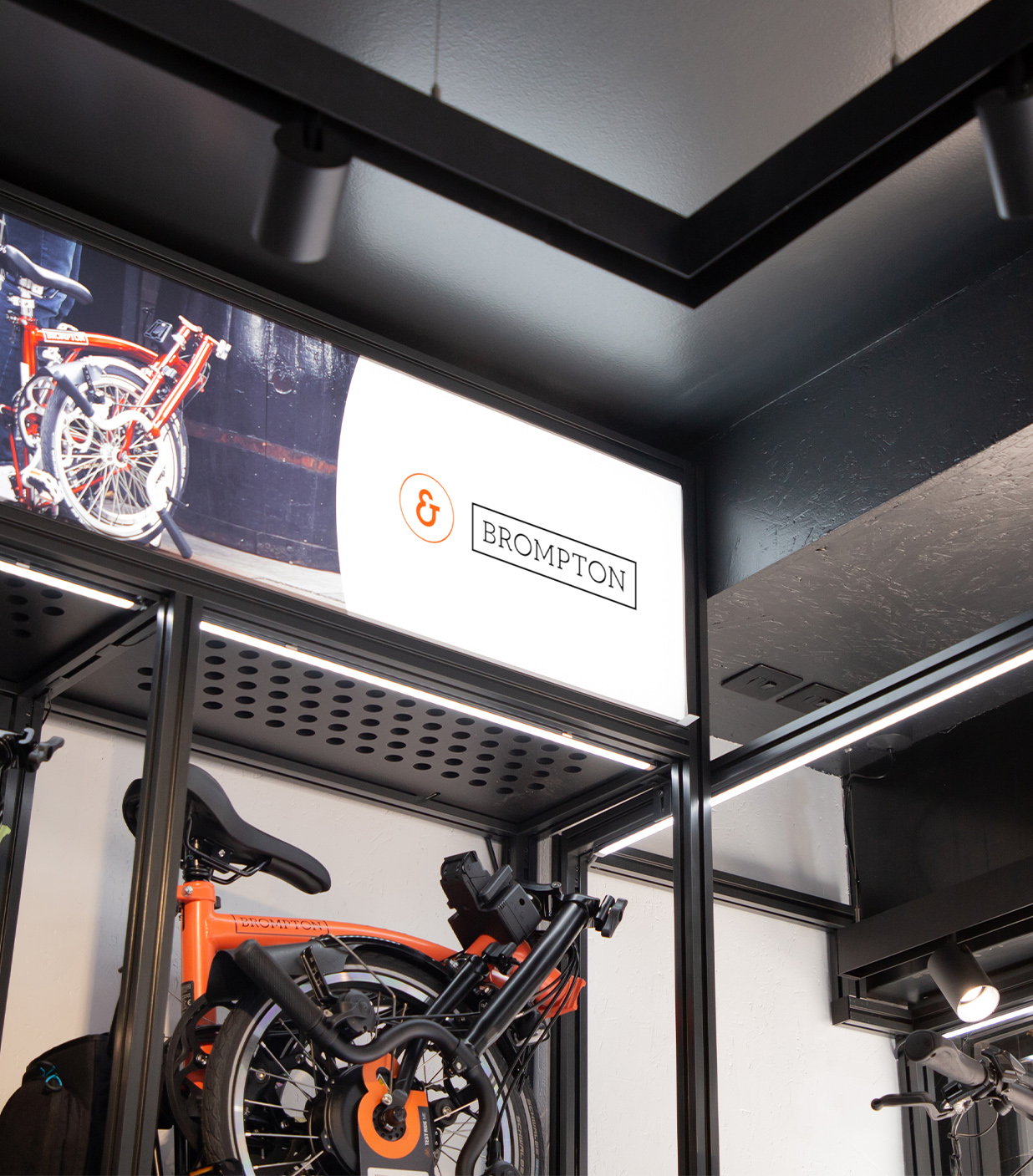
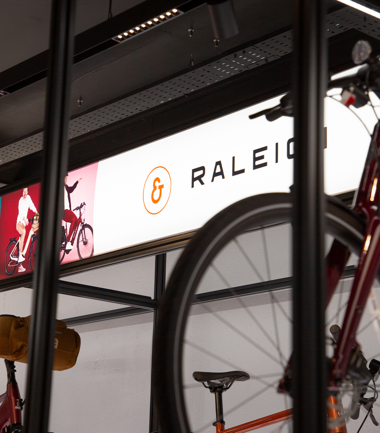
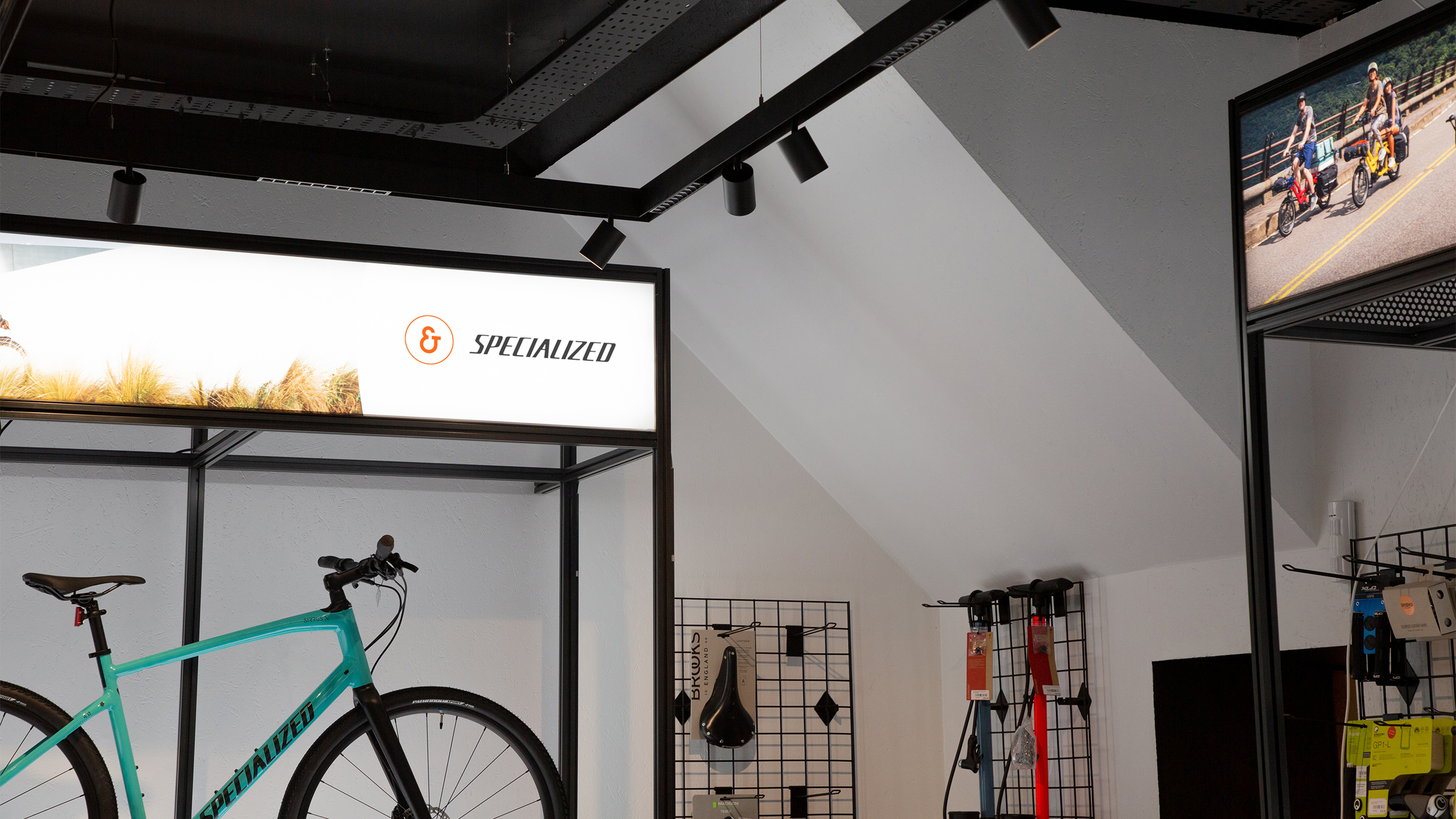
Signage Design
Art Direction
Agency
Public London Ltd
A Sense Of History For The Future
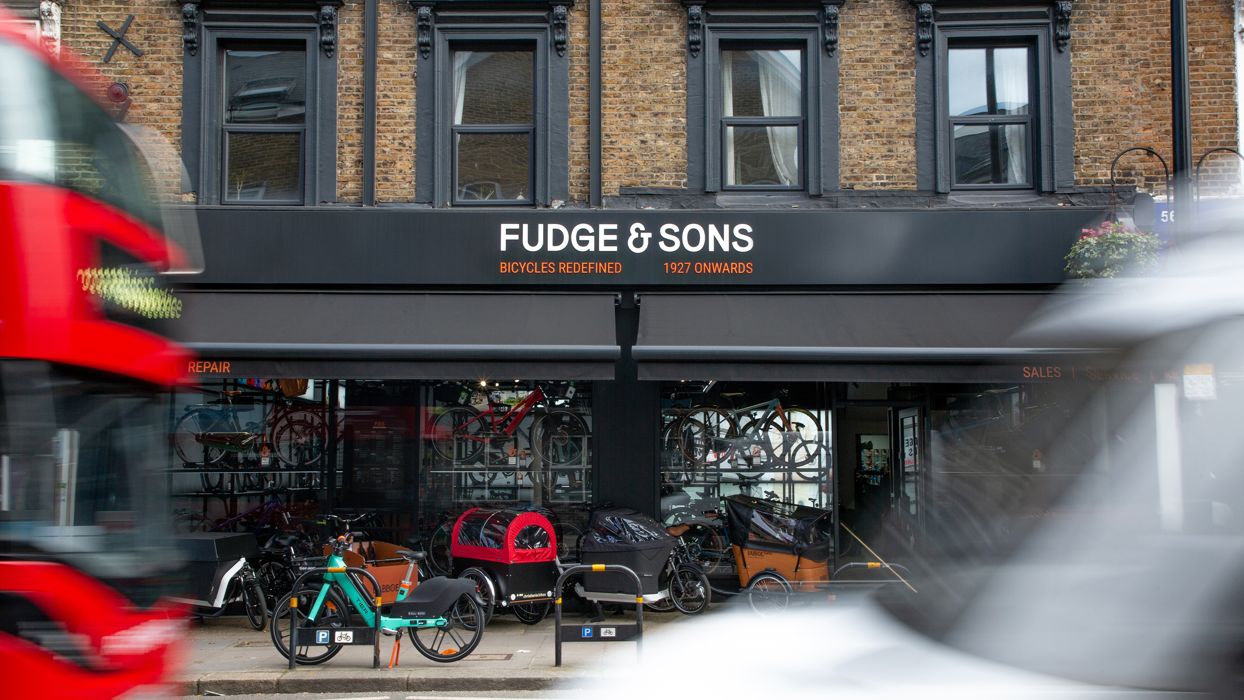
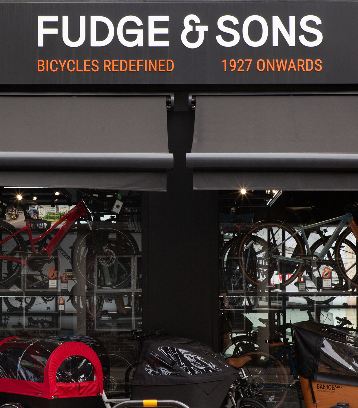
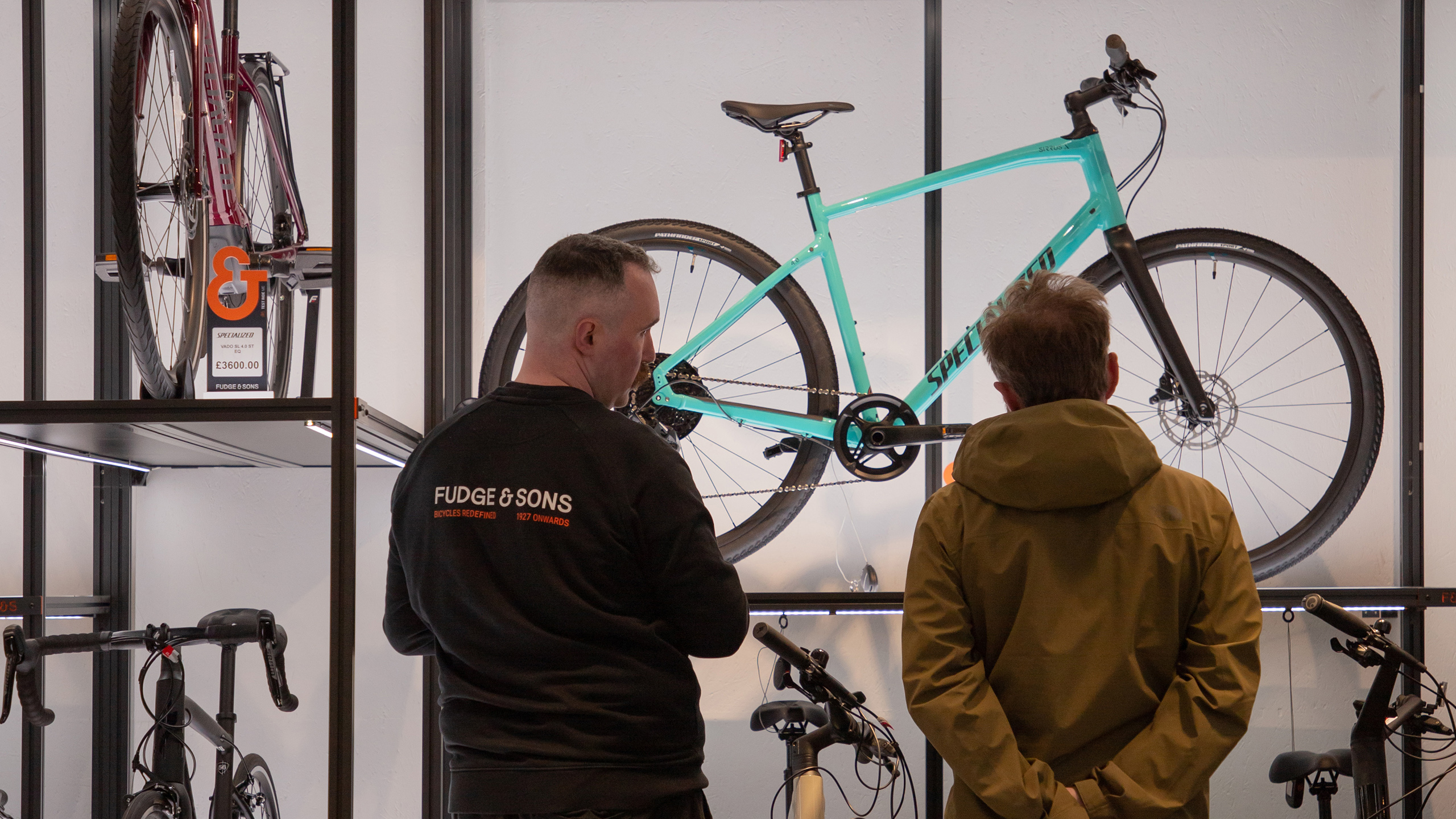
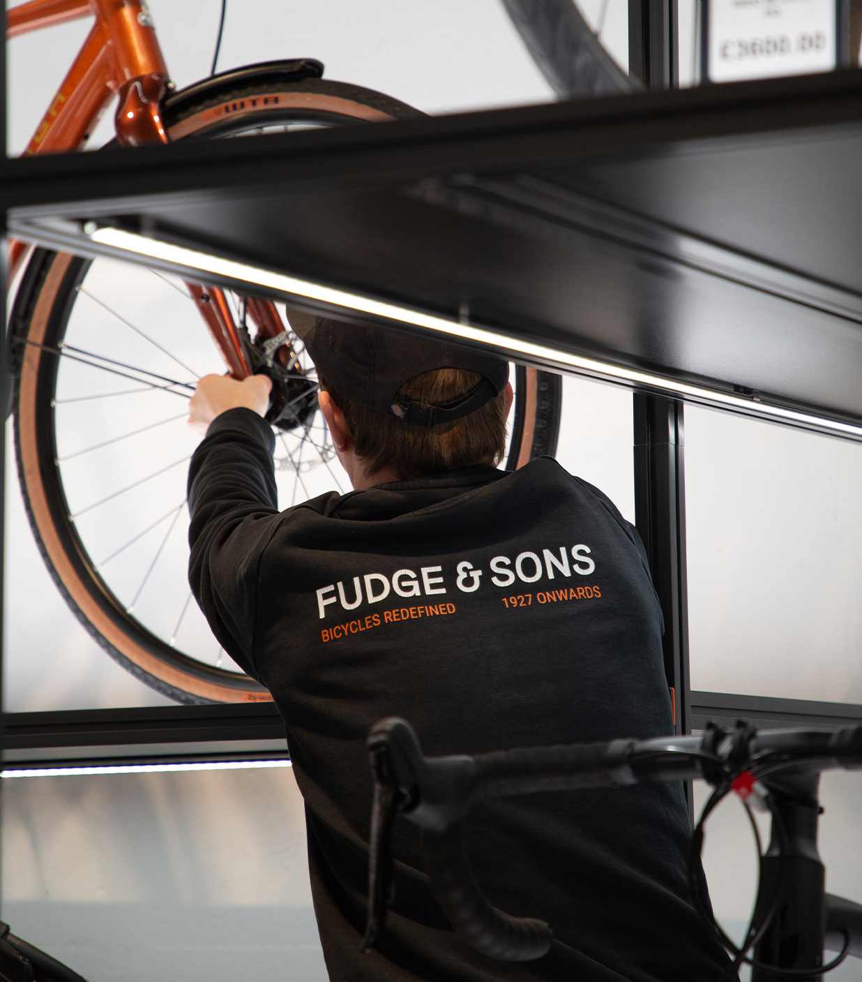
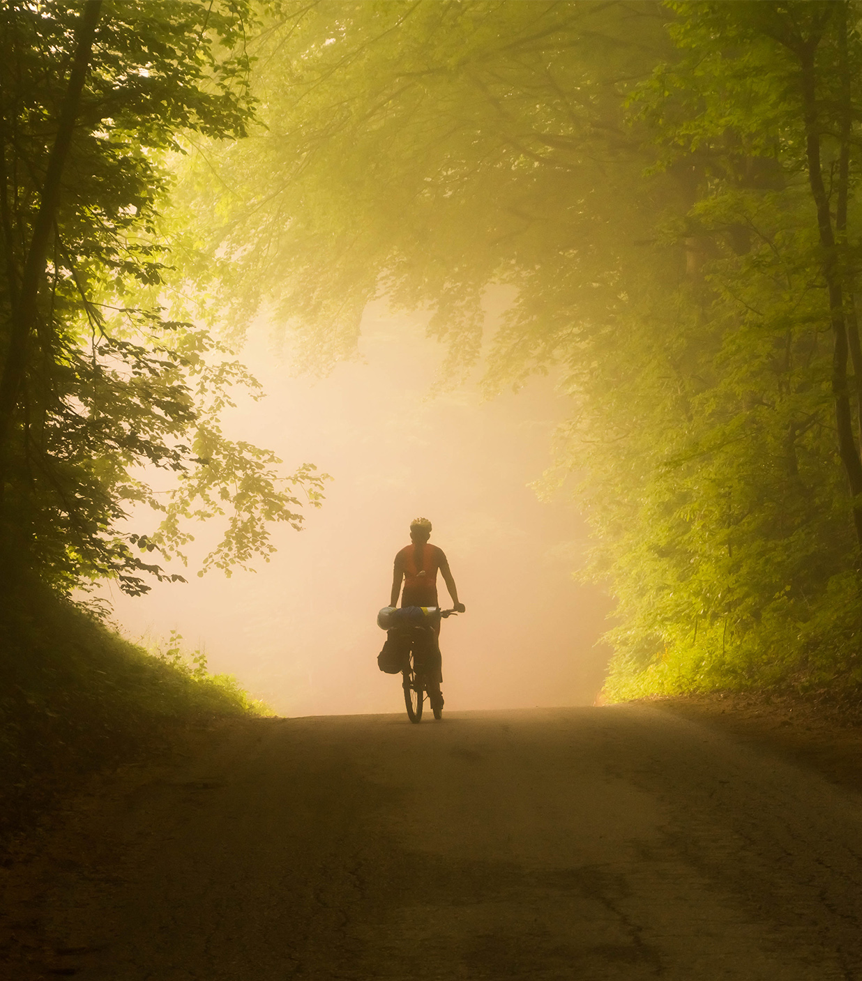
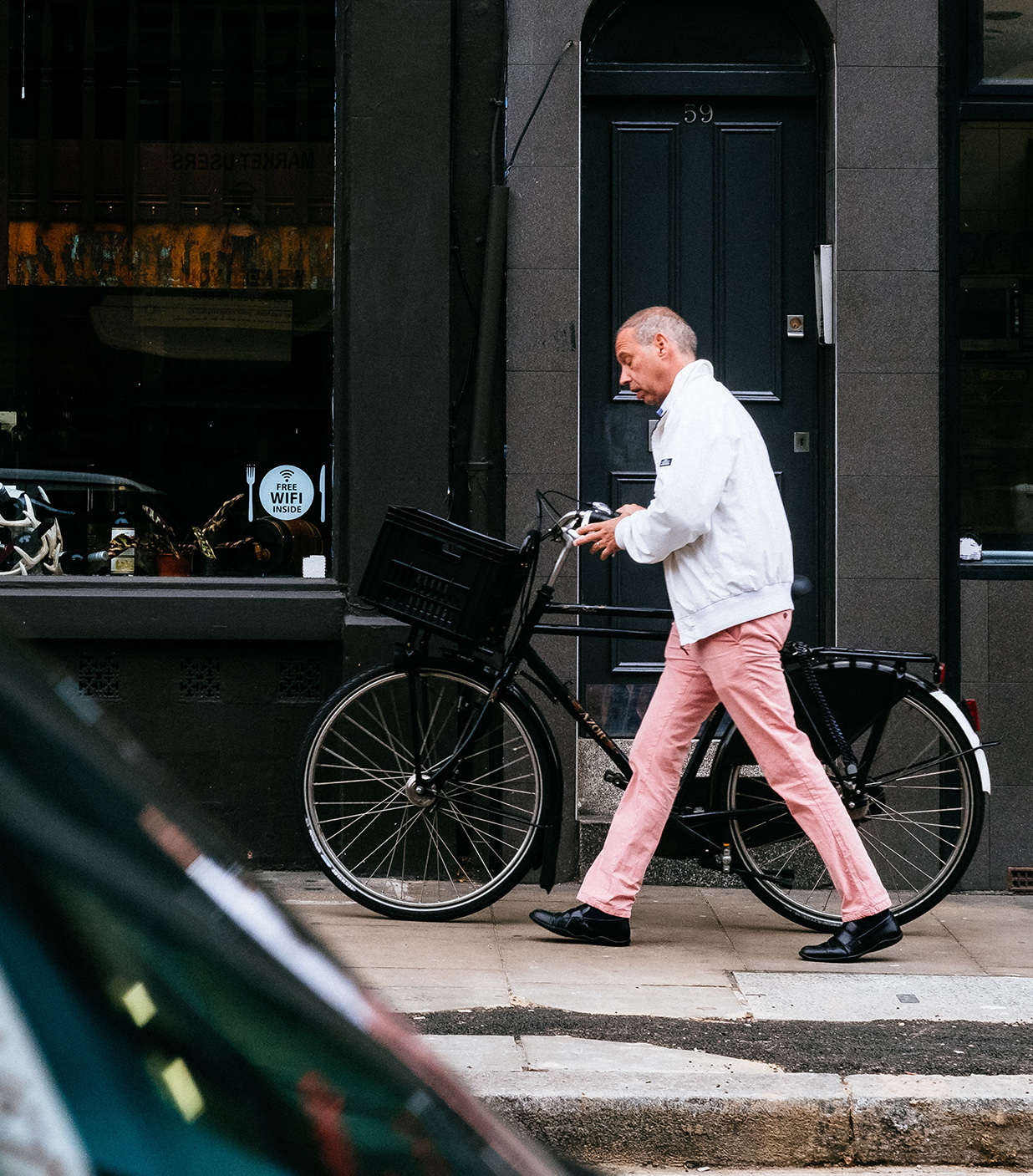
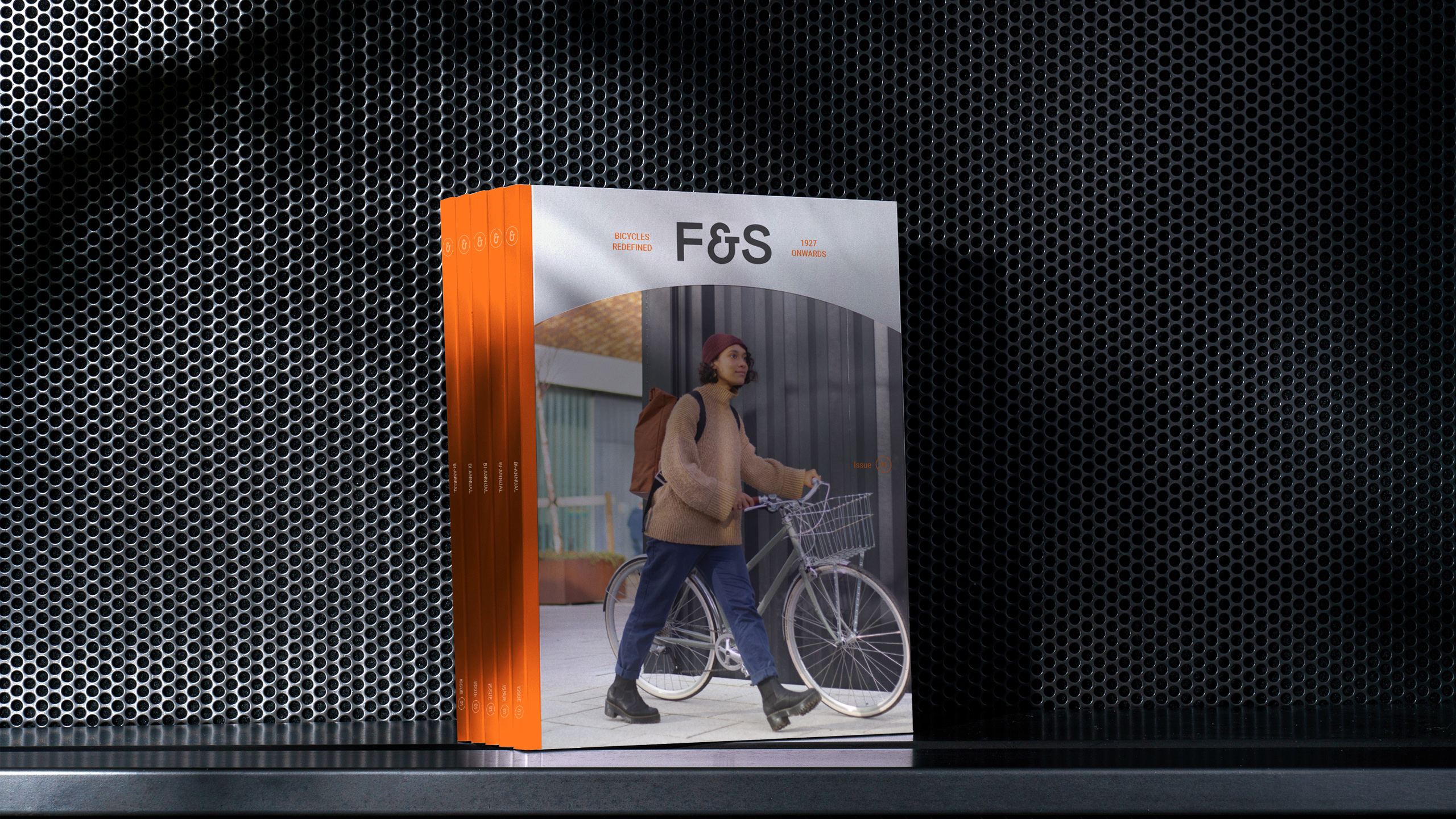
Founded in 1927, Fudge & Sons is one of the UK’s oldest independent bike retailers. But after years competing on price and cluttering shelves to match big-box rivals, it was time for change. Honouring their heritage, the brand became Fudge & Sons, refined their stocklist, and repositioned as a hub for pioneering brands and a trusted authority on quality.
Our task was to elevate the visual identity to match this new ambition — connecting past and present while engaging a new generation of riders.
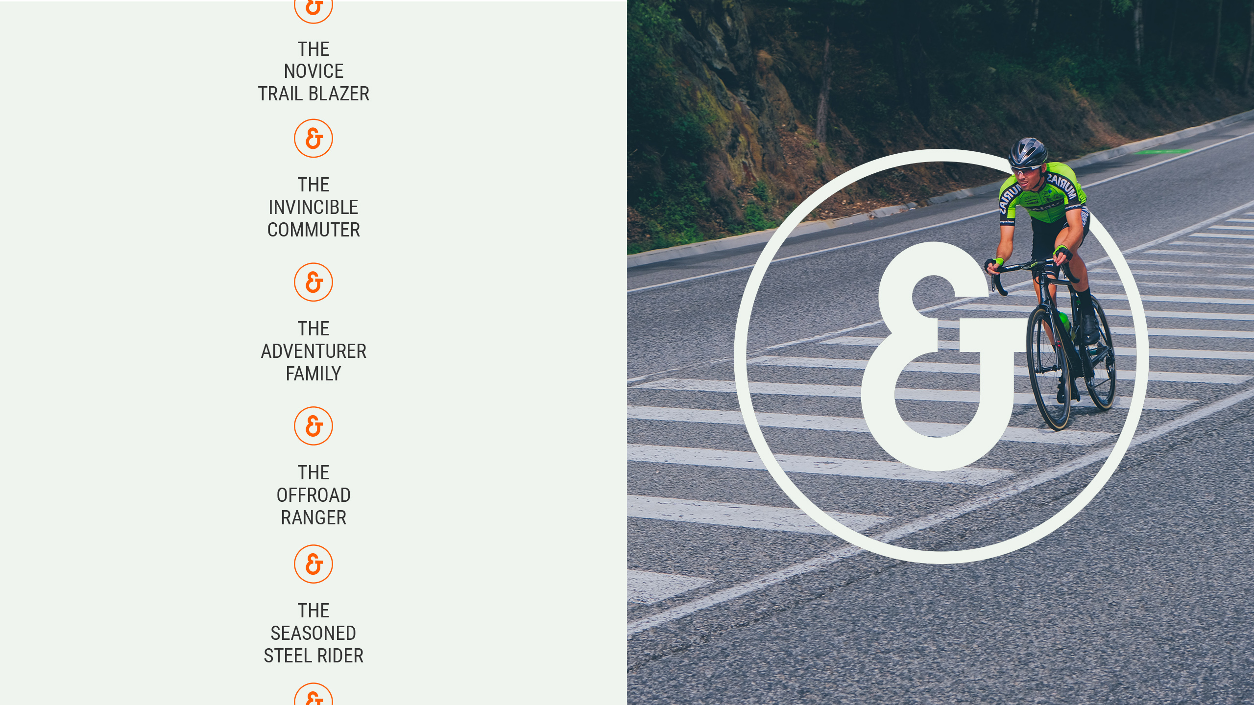
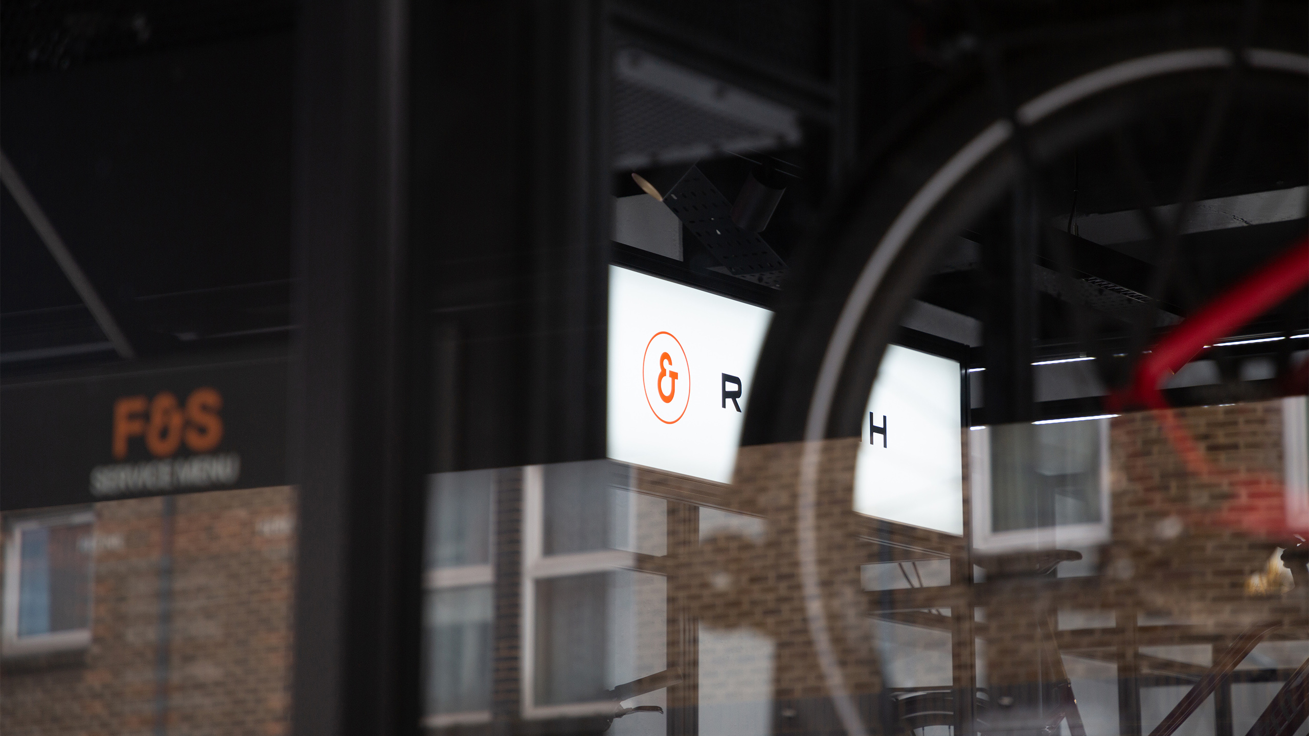
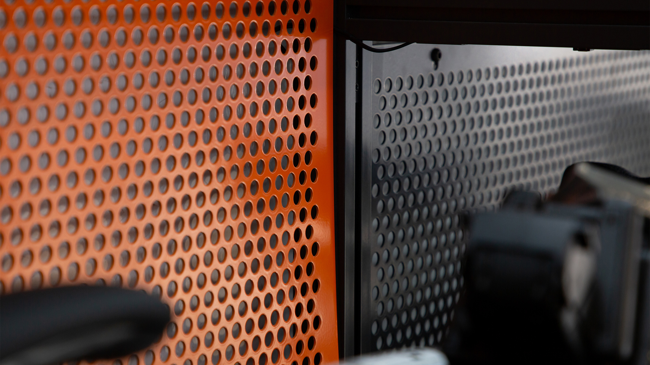
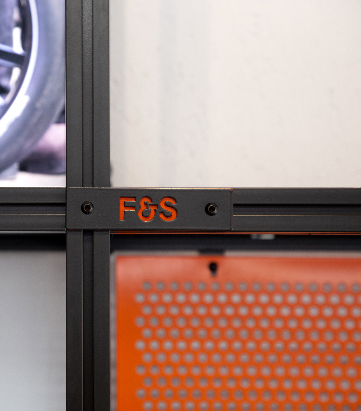
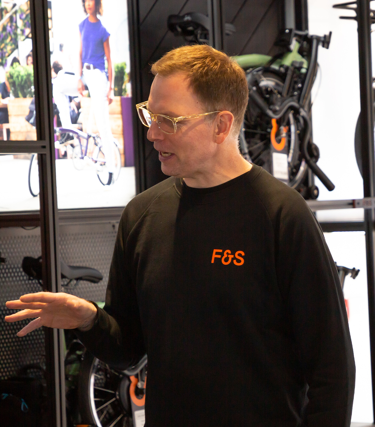
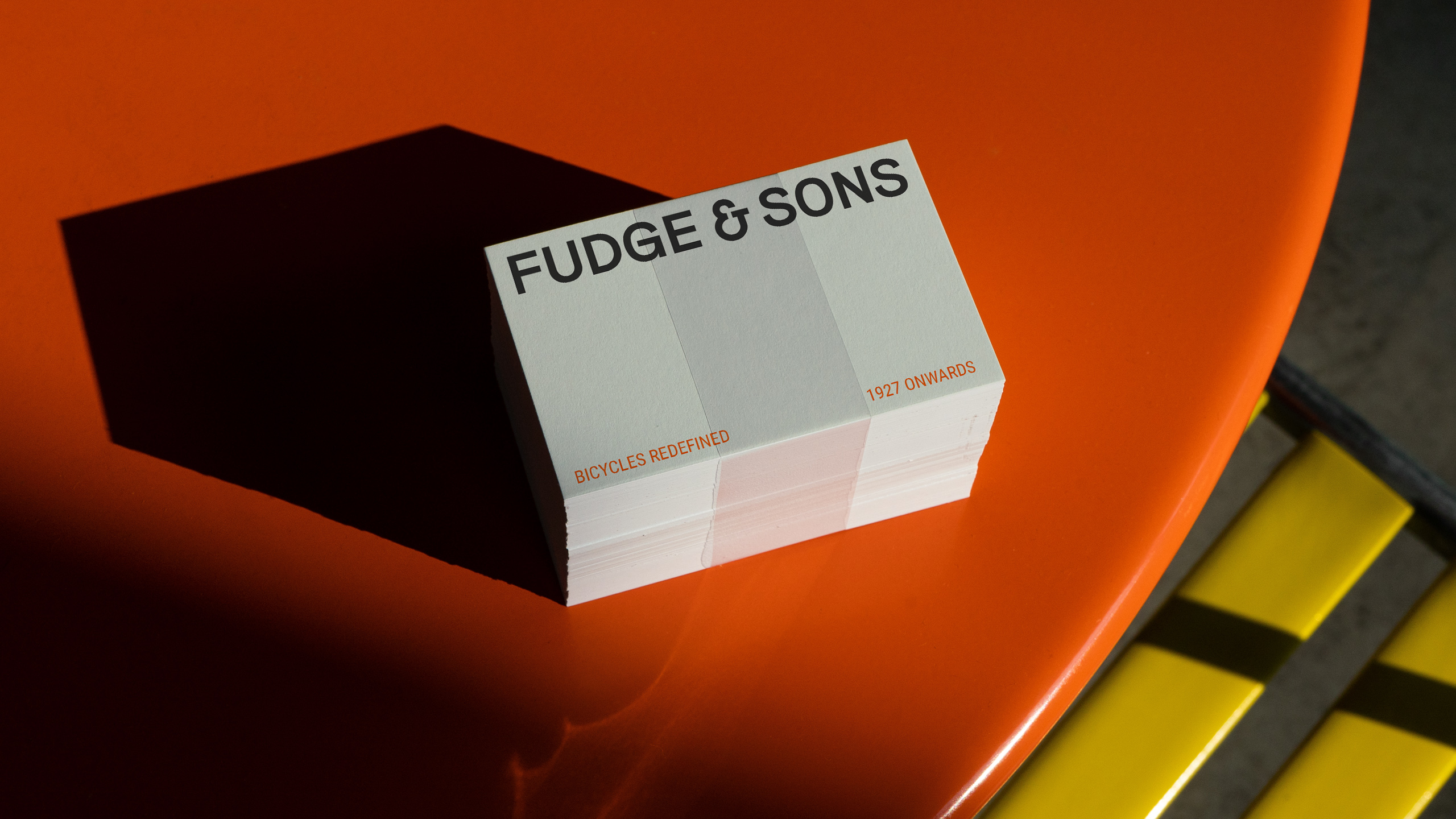
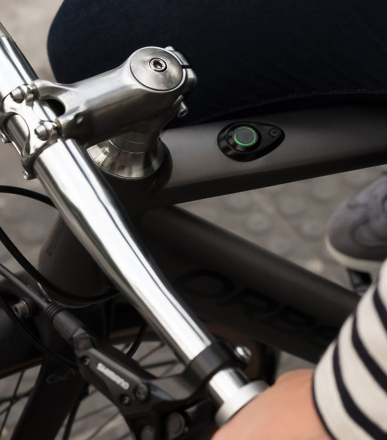
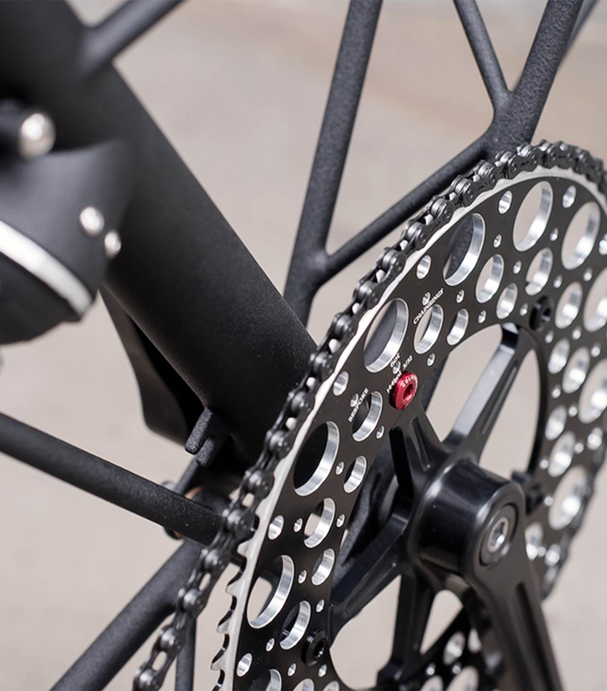
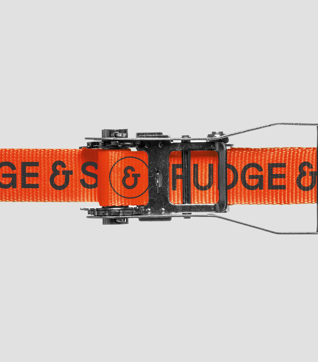
We crafted a clean, timeless visual language built on excellence and trust. A lean palette of rich tarmac, deep chalk, and a bold, ownable blood orange balanced heritage with modern appeal. The bespoke wordmark, with subtle quirks and a custom ampersand inspired by a bicycle silhouette, brought character and warmth.
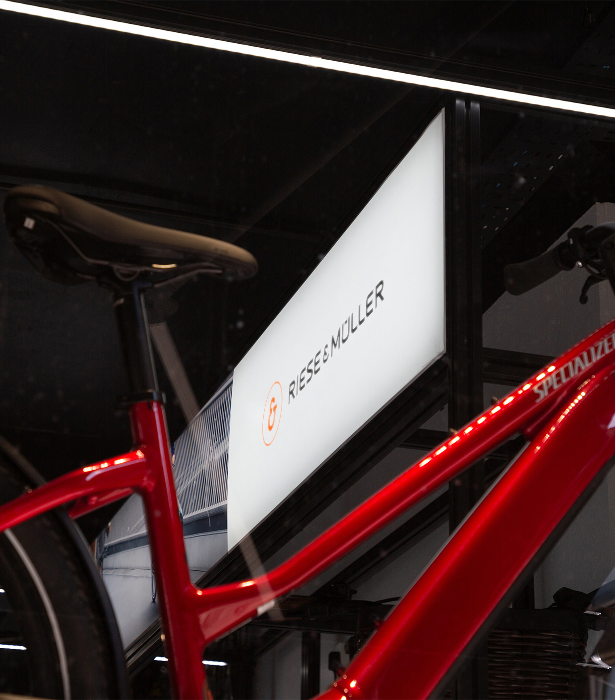
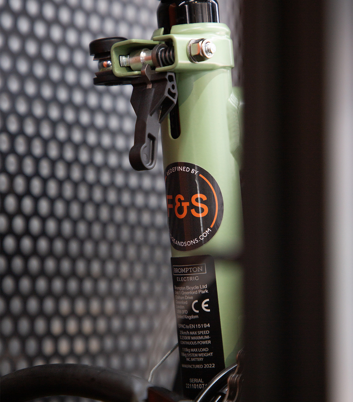
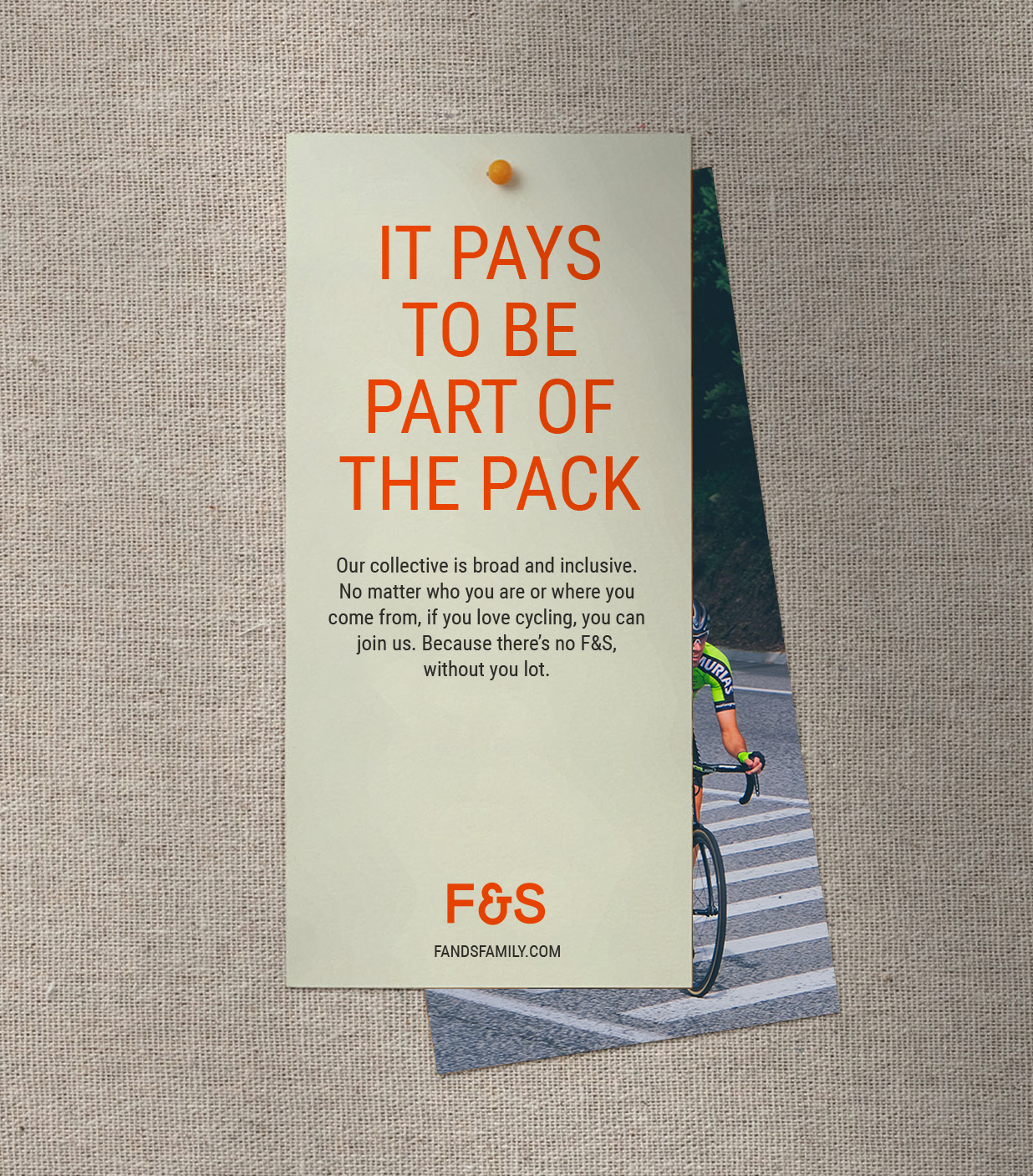
We also created a standalone ‘&’ stamp — a mark of endorsed quality and a bridge between Fudge & Sons and its partner brands. A symbol for all riders: the casual cruiser & the hill climber & the trailblazer & the daily commuter. A stamp of trust, service, and community — built to carry the brand confidently into the future.
Scope
Naming
Visual Identity
Print Design
Signage Design
Art Direction
Public London Ltd