A London-based, independent creative studio specialising in visual identities, digital design and photography.
Chonk Cookies
Scope
Naming
Brand Strategy
Brand Identity
Visual Identity
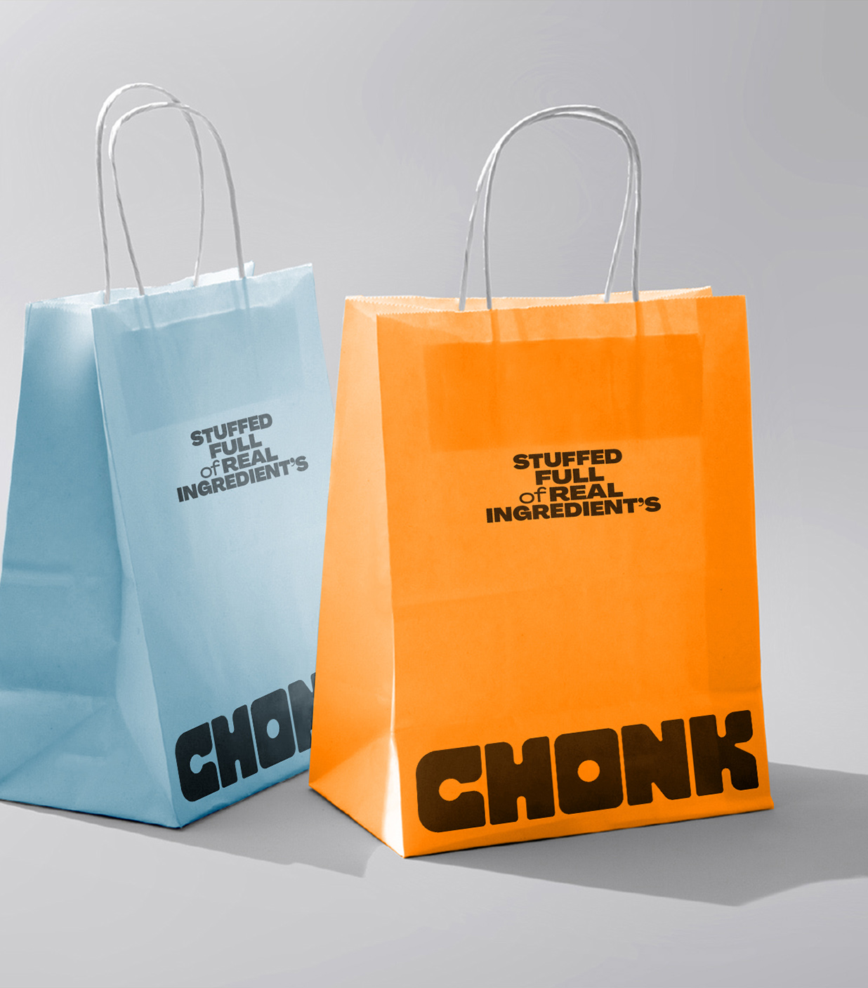
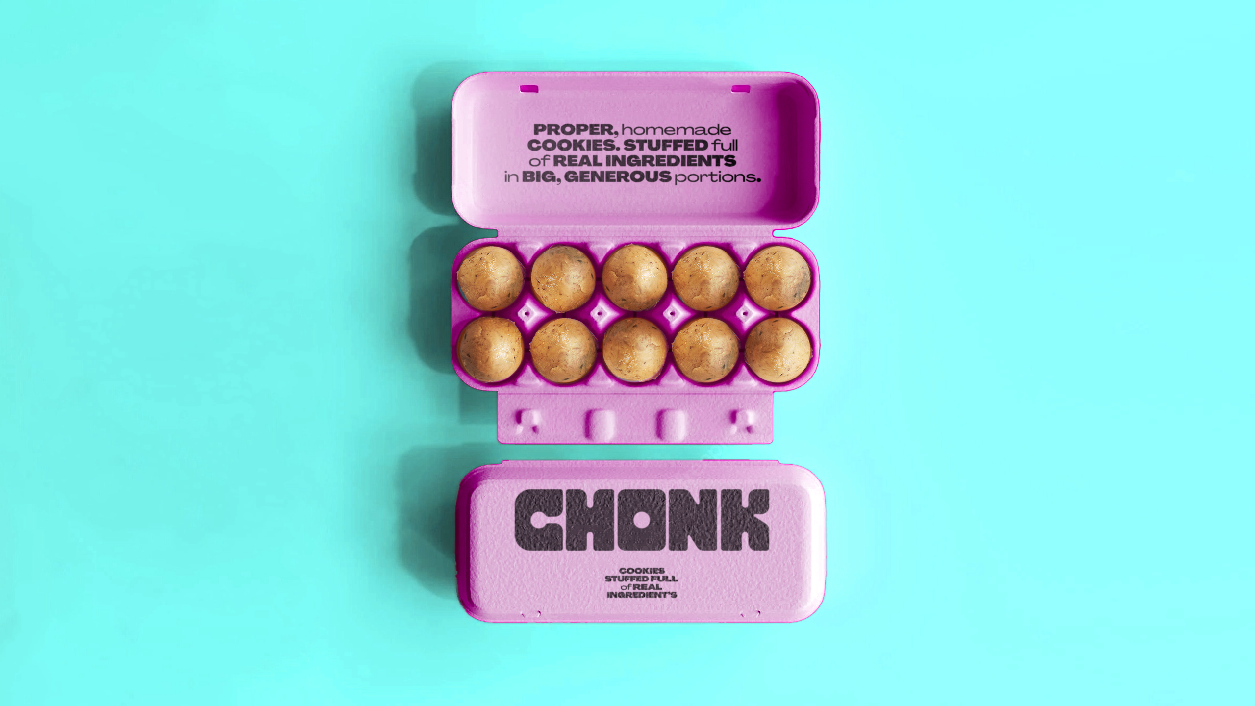
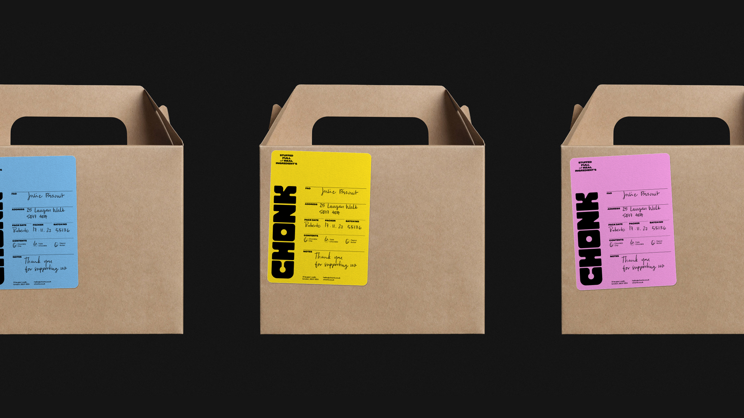
Packaging Design
Print Design
Art Direction
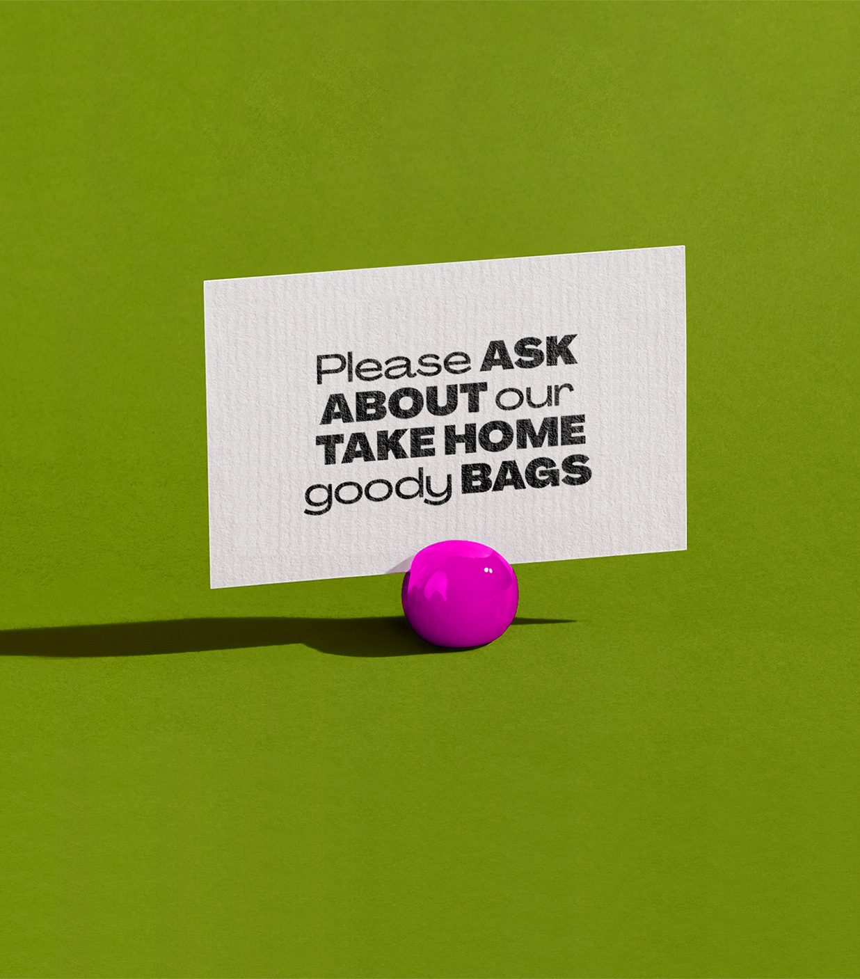
Give The People What They Want
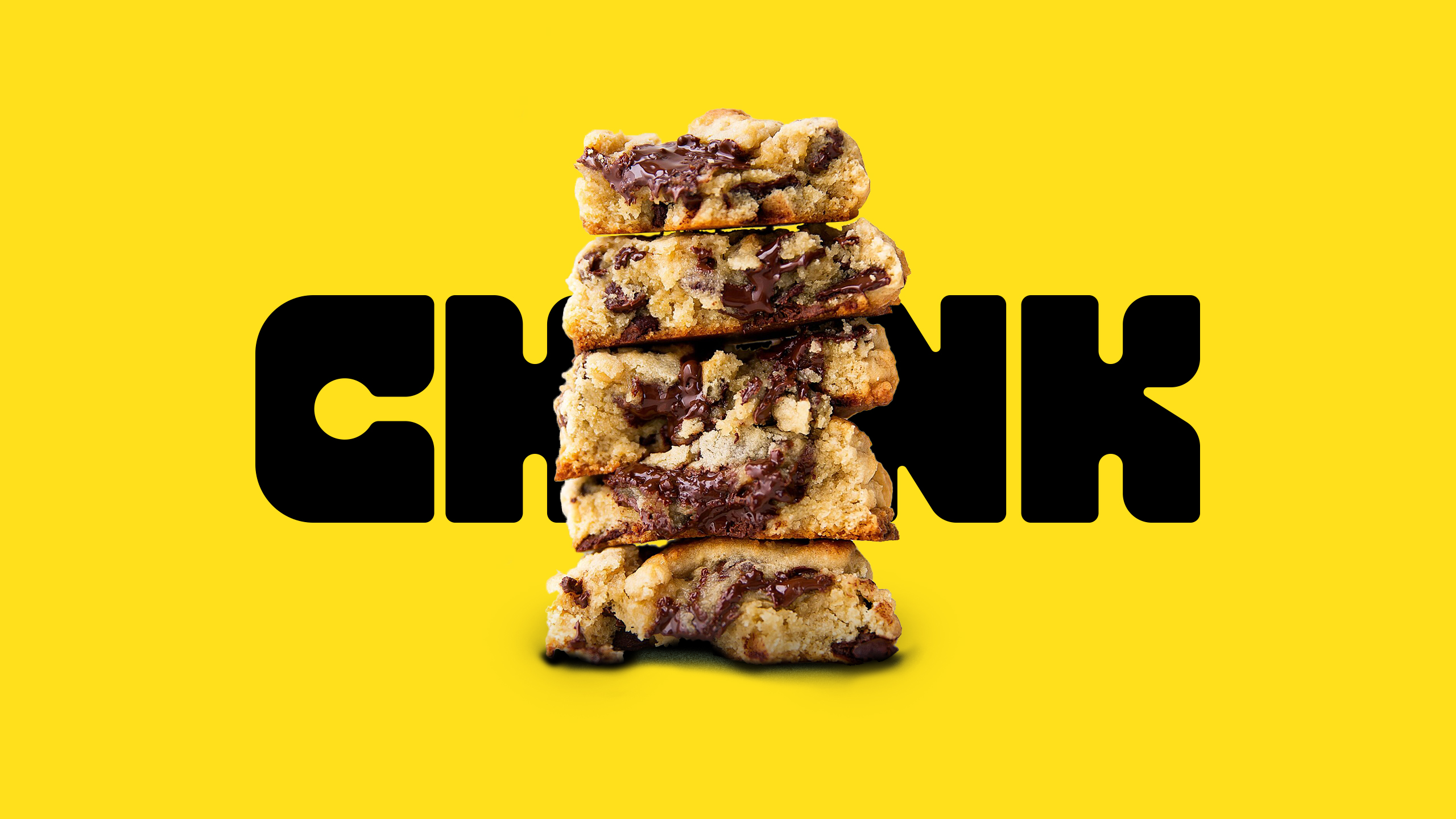
Chonk is a start-up on a mission to disrupt the dull UK frozen baked goods sector with properly delicious, warm cookies you can enjoy at home. With a realistic view on health and wellbeing.
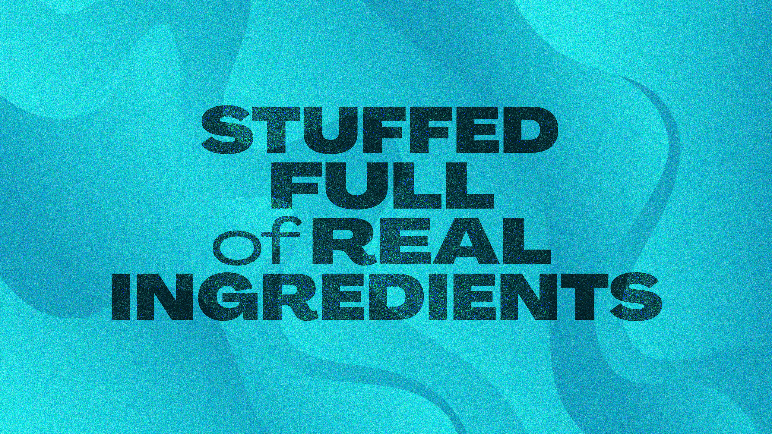
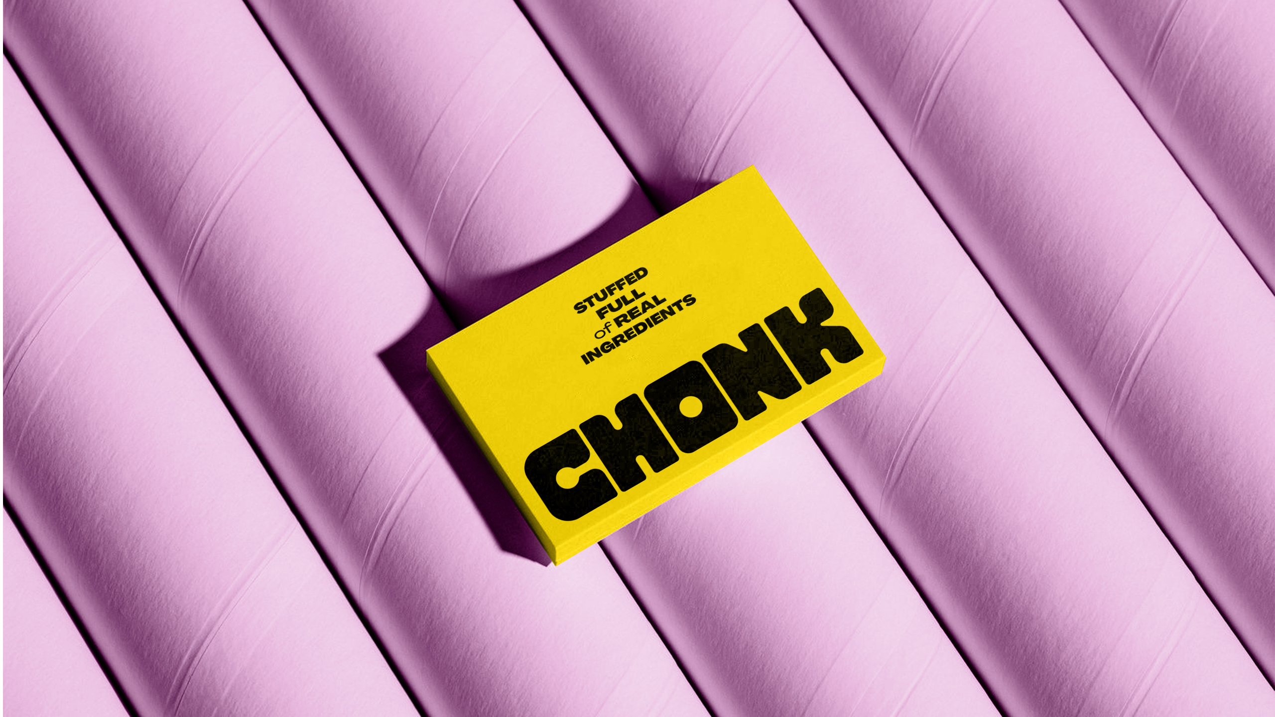
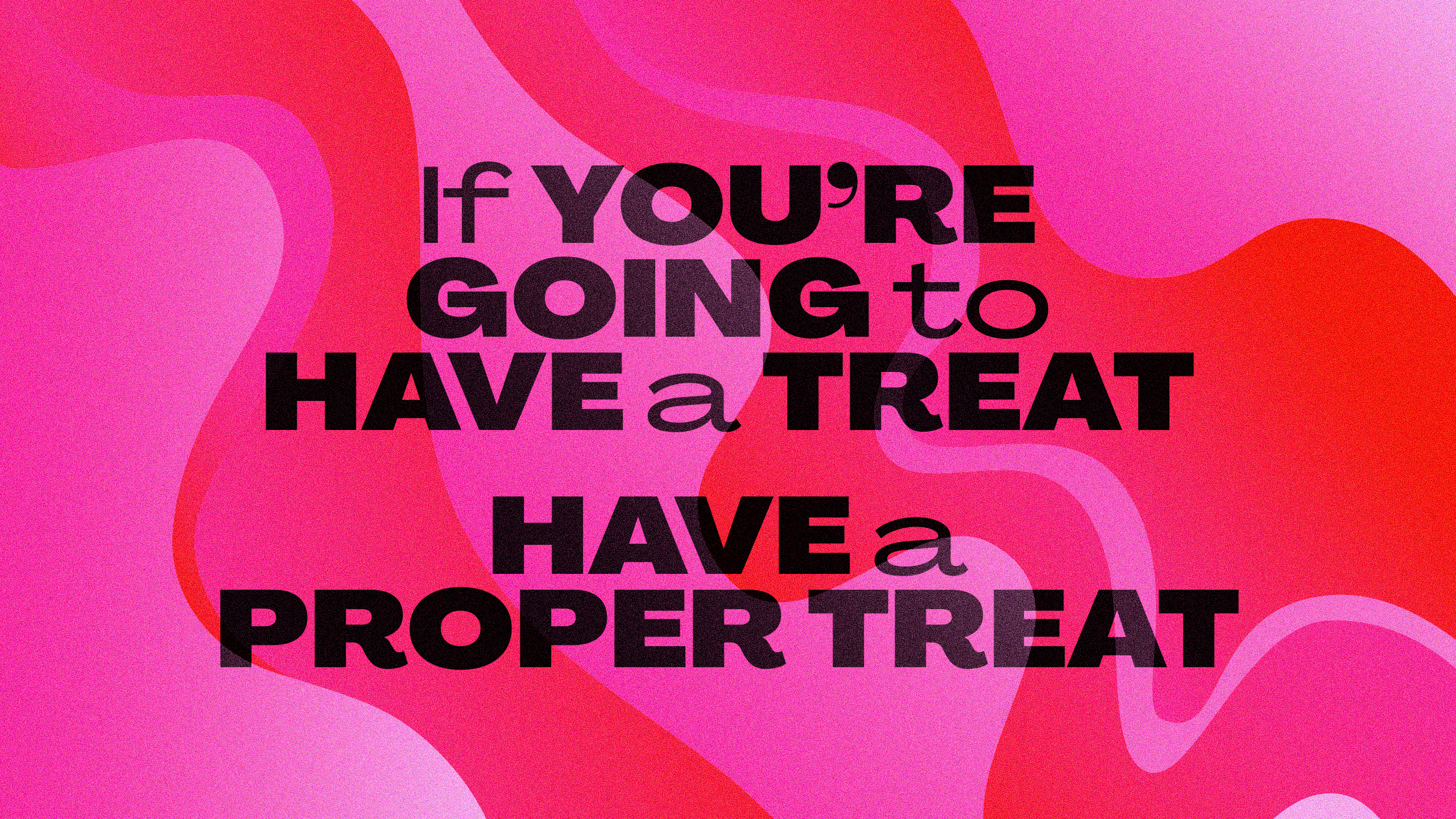
We helped define their proposition: ‘if you’re having a cookie, make it worth it.’ Chonk doesn’t play in the diet or low-sugar space — their cookies are unapologetically indulgent, generous, and inclusive – made entirely from natural ingredients. Because it’s healthy to enjoy life’s pleasures.
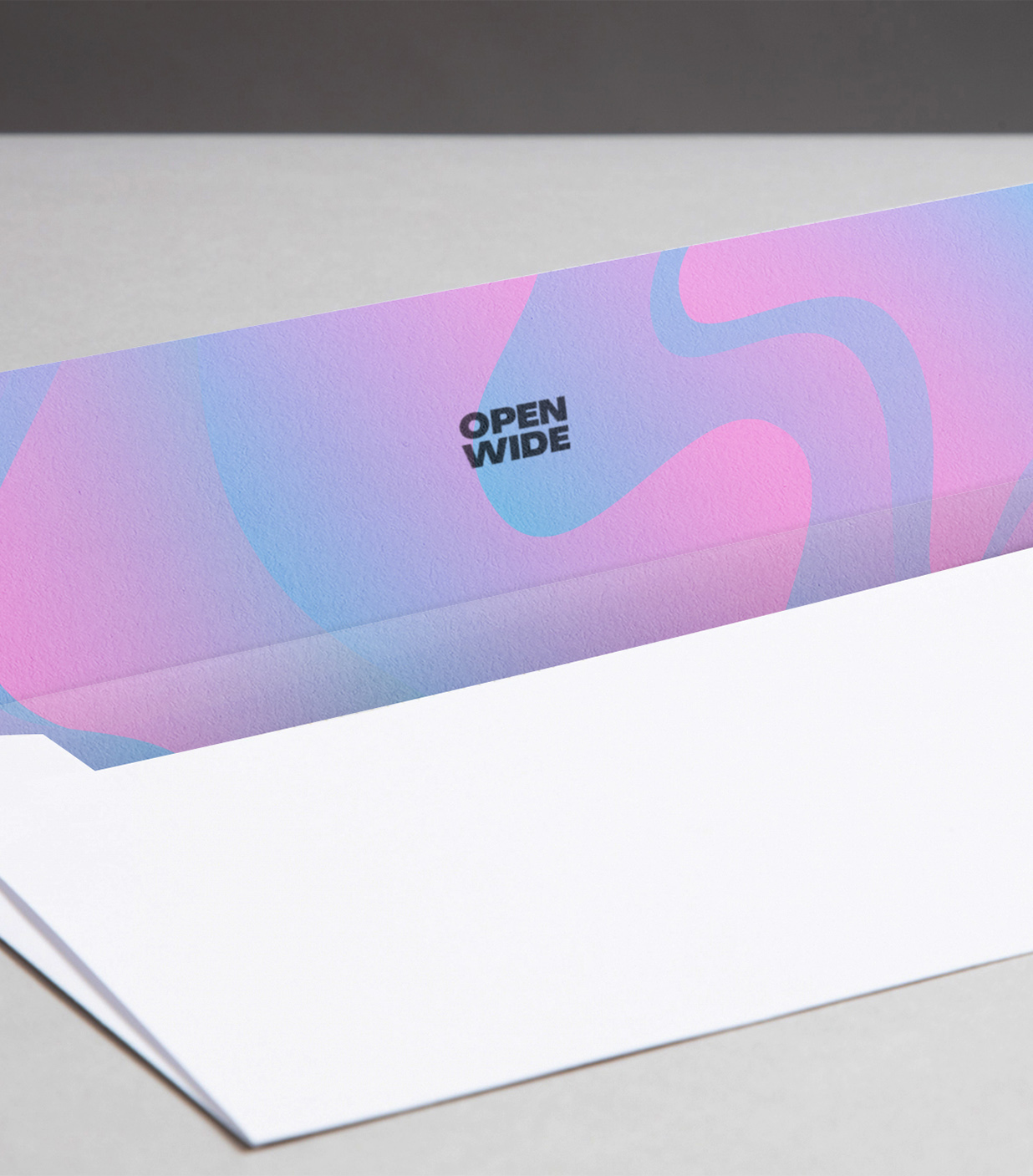
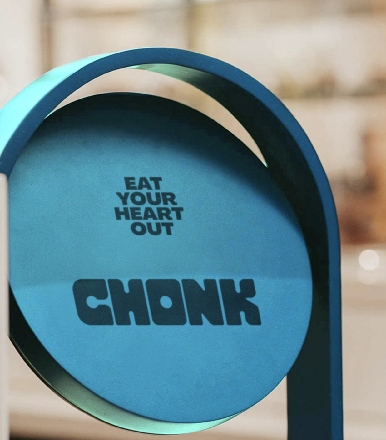
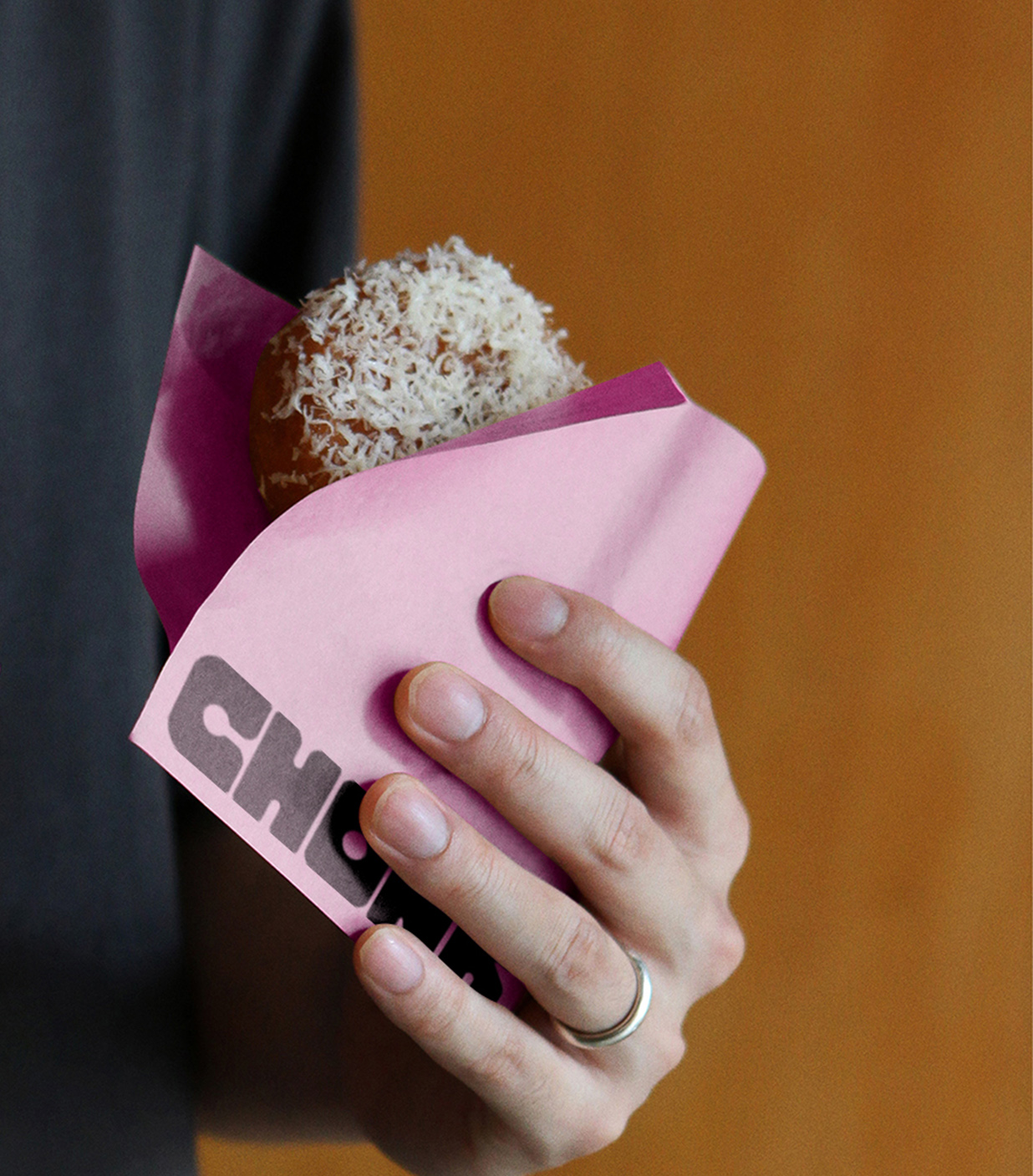
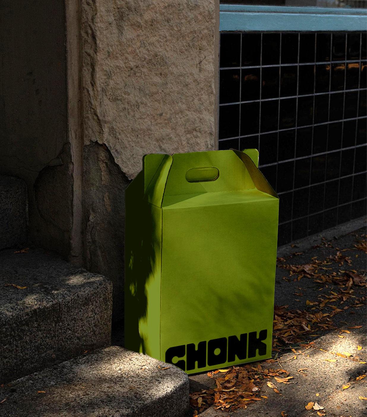
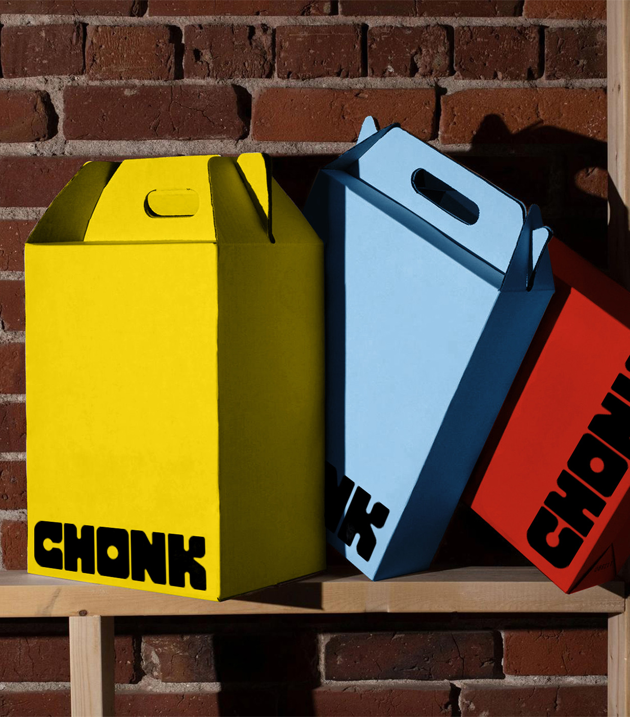
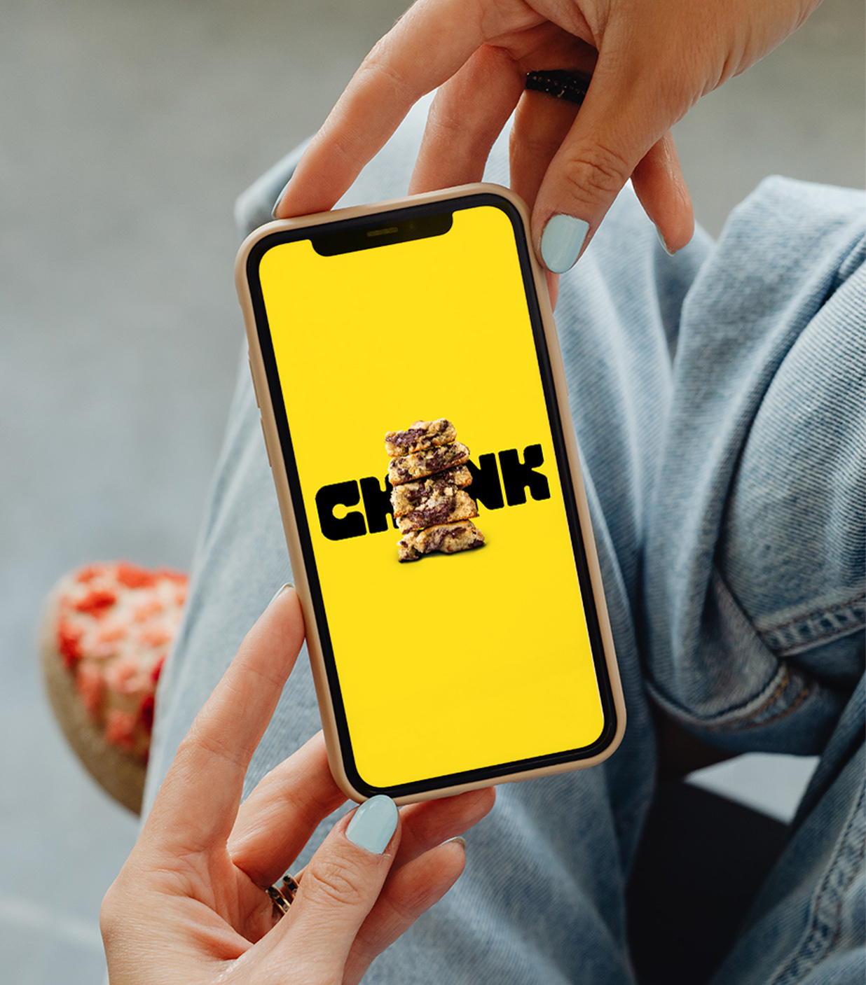
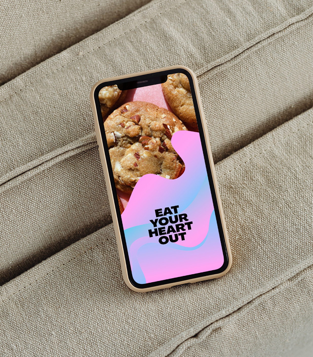
The visual identity celebrates the joy of a truly great cookie — bold, playful, and proudly generous. We crafted a stocky wordmark designed to cut through clutter and created tactile, radiant patterns inspired by melted ingredients, giving Chonk a distinctive signature aesthetic. A vibrant colour palette ensures standout across a wide range of flavours. And because a bold brand needs a bold voice, we chose Pangram Pangram’s Agrandir — a perfectly imperfect typeface to carry Chonk’s roaring personality.
Scope
Naming
Brand Strategy
Brand Identity
Visual Identity
Packaging Design
Print Design
Art Direction